
Cedar Grove Dental
Fictional design example. Names, quotes, and results are illustrative.
An approachable dental website that answers the questions new patients ask and makes their first appointment easy to request.
Open website preview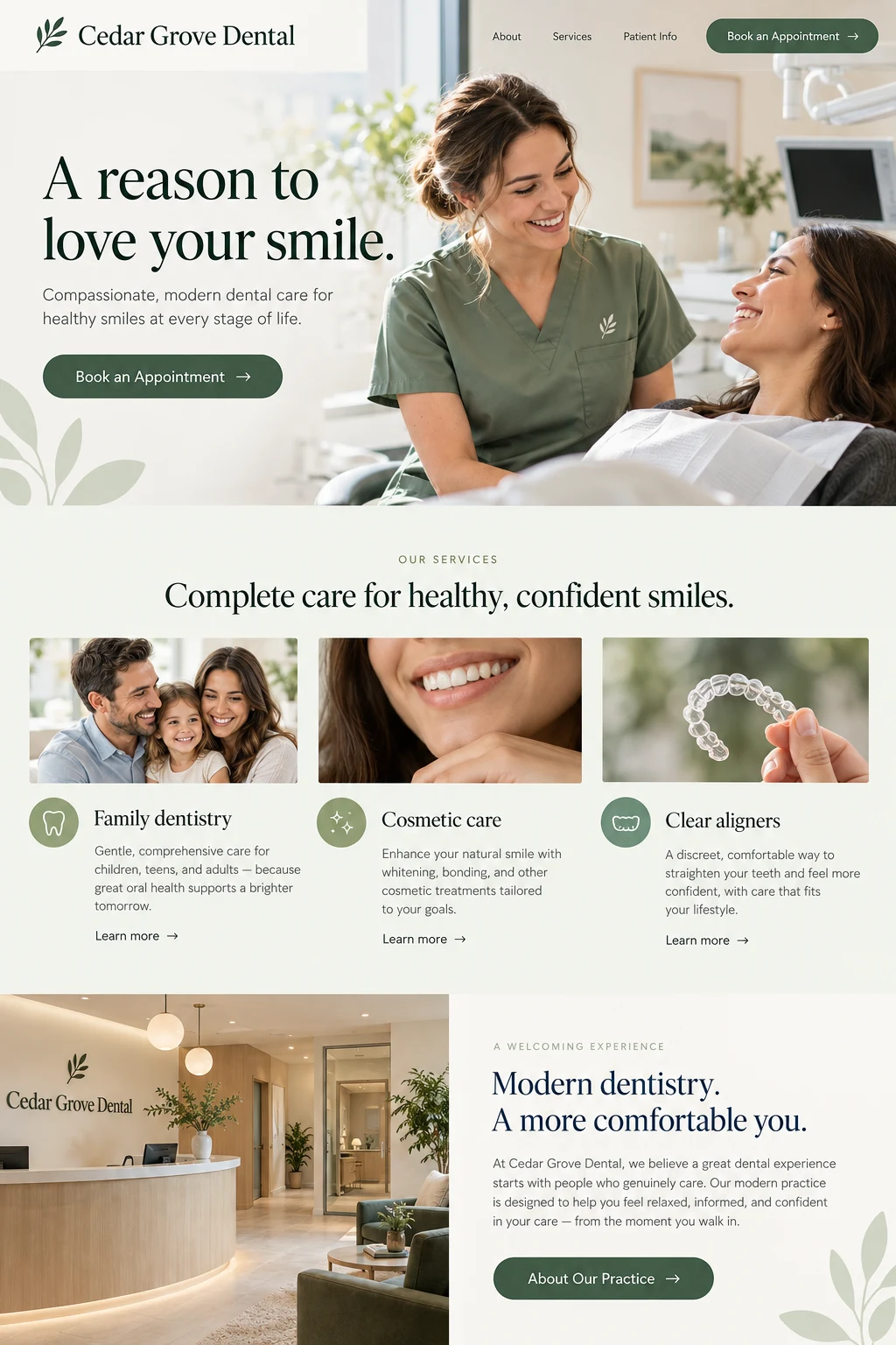
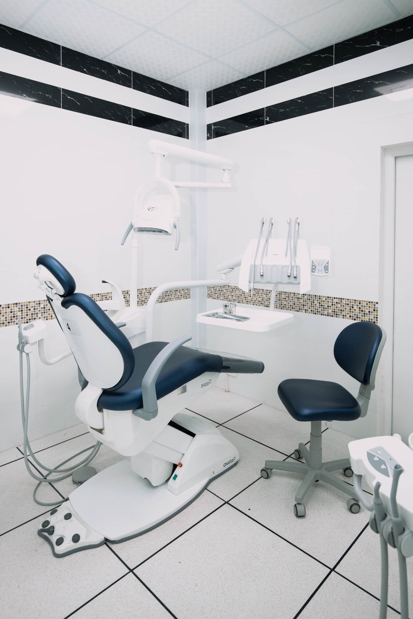
“Patients arrive already feeling at home.”
Where we started
Cedar Grove wanted to welcome more families without losing the personal feel of the practice. Its old site buried practical details about first visits, services, and appointment requests. New patients often called with the same questions, while the front desk had to piece together inquiries from different places.
What we built
Help patients feel comfortable
We built the visual direction around soft greens, natural light, and friendly photography. Plain-language service pages explain what a visit involves, with a dedicated place for the questions people ask before choosing a dentist.
Simplify the first appointment
A short appointment request sits within easy reach on every page. Visitors can share what they need and their preferred timing, while the front desk receives the details in one place.
Give the team room to care
The new inquiry workflow makes it clear which requests need attention. Our team maintains service information and new photography, leaving the practice free to focus on the people coming through the door.
What changed
The practice’s feedback was simple: patients arrived already feeling at home. They knew more about the team and what to expect, and appointment requests came with useful context. The result was a calmer first conversation for patients and the front desk alike.