
Align Chiropractic
Fictional design example. Names, quotes, and results are illustrative.
A clear, confident website that turns interest in better movement into a conversation with the right team.
Open website preview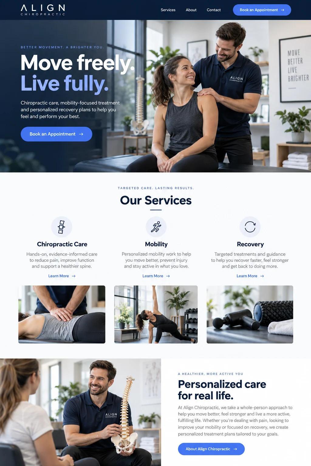
new patient inquiries in the first month.
Where we started
Align’s services were easy to understand in person, but the previous website made visitors work to connect their needs to the right appointment. The practice needed to explain its approach more clearly, make mobile booking straightforward, and respond quickly when someone was ready to talk.
What we built
Start with everyday needs
We organized the site around the questions people bring to the practice. Short, accessible pages introduce chiropractic care, mobility, and recovery without asking visitors to navigate a wall of technical language.
Design for the phone in their hand
The homepage leads with a clear introduction, helpful photography, and a direct appointment request. Important information stays easy to find on small screens, where many new visitors first discover the practice.
Connect interest to a reply
New patient inquiries trigger an alert and appear in the shared inbox. The team can see who has responded and what comes next, making follow-up part of the workflow instead of a separate reminder.
What changed
The first month brought 38 new patient inquiries through the redesigned site. The team could see which services people were interested in and respond from a shared conversation, giving prospective patients a more consistent start to their experience.