
Aurelia Med Spa
Fictional design example. Names, quotes, and results are illustrative.
A warm, considered website that helps new clients understand their options and take the first step with confidence.
Open website preview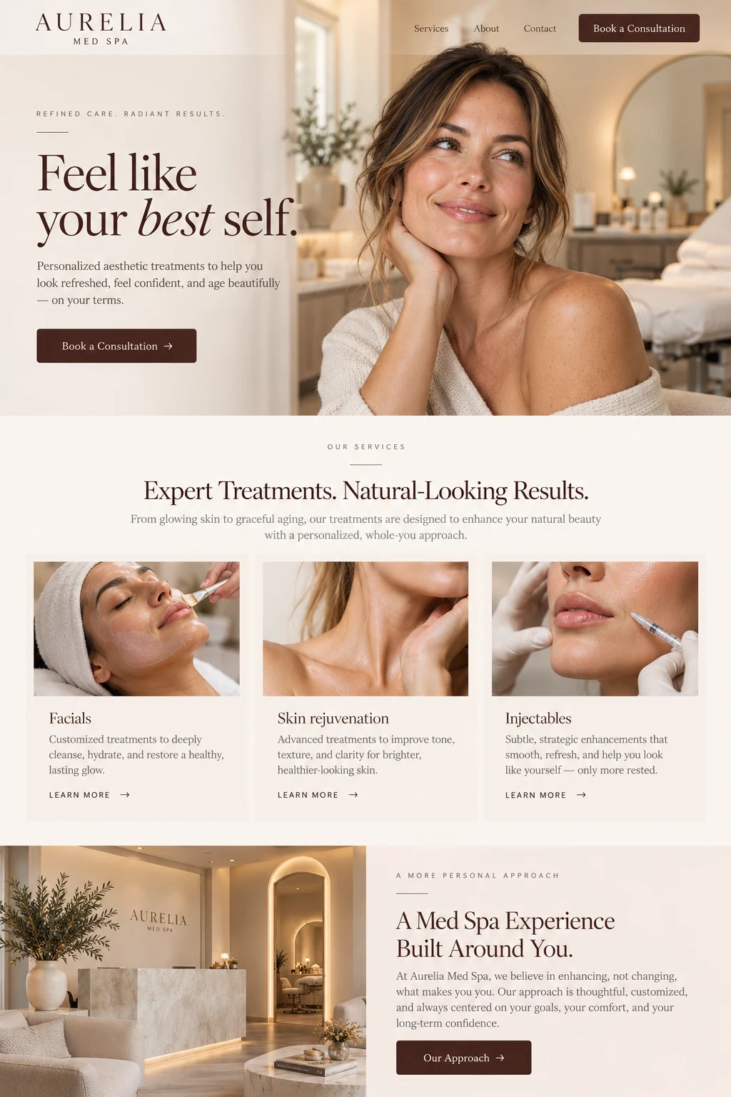
more consultation requests in 90 days.
Where we started
Aurelia had a beautiful space and a personal approach to treatment, but its website felt like a list of procedures. Visitors needed a clearer sense of the experience, the people behind it, and which consultation to choose. The team also needed inquiries to arrive with enough context to make the first conversation useful.
What we built
Bring the experience online
We paired a warm palette and generous photography with straightforward treatment explanations. The homepage introduces the practice through its approach to care, helping visitors feel comfortable before asking them to book.
Make the next step obvious
Each treatment page leads to a focused consultation request. Short forms collect the visitor’s interests without turning a simple inquiry into paperwork, and mobile visitors can find that next step without searching.
Keep the conversation moving
New requests flow into a shared inbox with the treatment interest attached. The concierge team handles seasonal offers, new photos, and content updates so the site keeps reflecting the practice.
What changed
In the first 90 days, consultation requests grew to 2.4 times the previous level. Just as useful, the team began conversations with a clearer understanding of what each person wanted. The website became a natural introduction to the practice instead of another task to manage.